220 Hammersmith, London
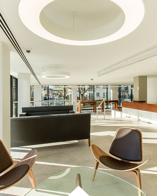
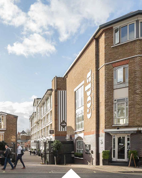
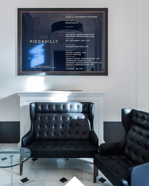
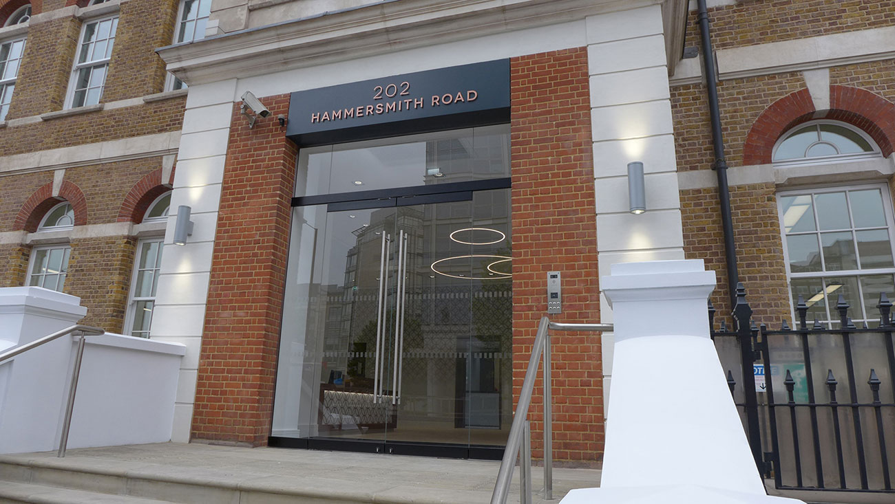
Standard Life Investments commissioned Gravity to re-present the old Sony headquarters in the popular Hammersmith office area. The brief included refreshing the reception areas and building entrance to make the building appeal to a wide range of customer profiles.
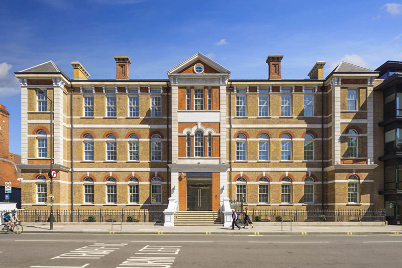
Creating a light space.
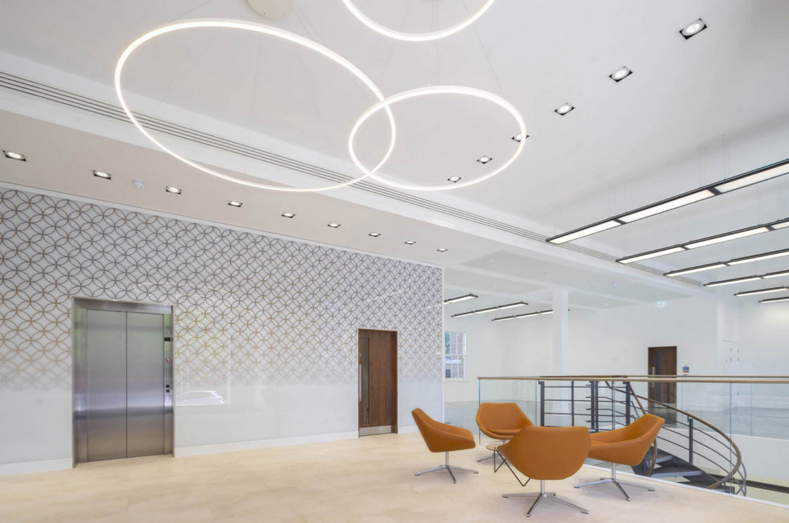
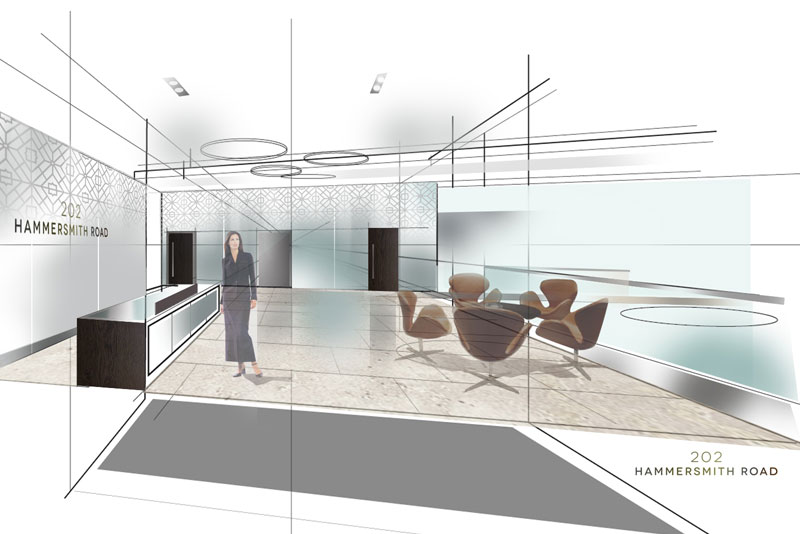
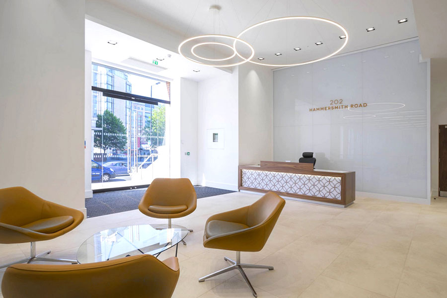
Gravity stripped back the interior architecture significantly, creating a light space and allowing south facing sunlight to flood the space. We introduced a graphic pattern over large format glazing, which could be changed by the new tenant. All finishes were kept simple and minimal to allow a new tenant to implement their identity on a clean palette.

Detail and flexibility.
The concept successfully blended a large light volume with light and clean finishes and the introduction of a graphic language adding both detail and flexibility.
Strategy and implementation
for building brands.
Gravity's range of services includes interior design, project management, identity, signage systems and environmental art. We know how to transform tired buildings, turning them into engaging, vibrant and creative spaces. Please take a look at the projects below to see further examples of our work.

